


 This here was my final project for the year. It's another artbook, except this time it features only my own art and it's heavily inspired by fashion illustration.
My instructor recommended I try a different approach from the manga stuff if I was going to do another book, and I'm quite glad I did. It was a very refreshing change, having to deal with a style which I'm totally unfamiliar with. At the same time, it was also quite a mission getting a handle of new techniques while while trying to produce something presentable and put it into book form in the given time period.
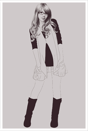
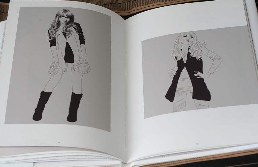
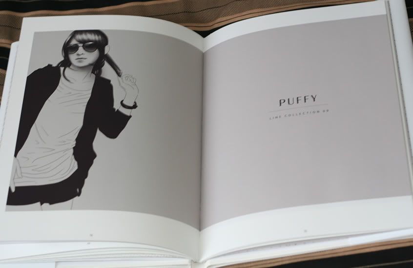
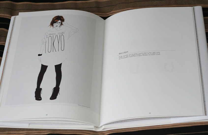
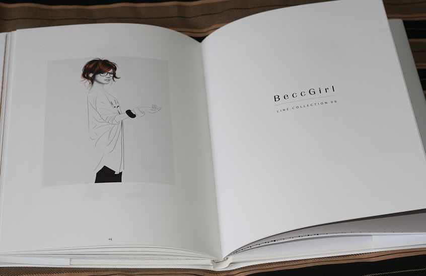
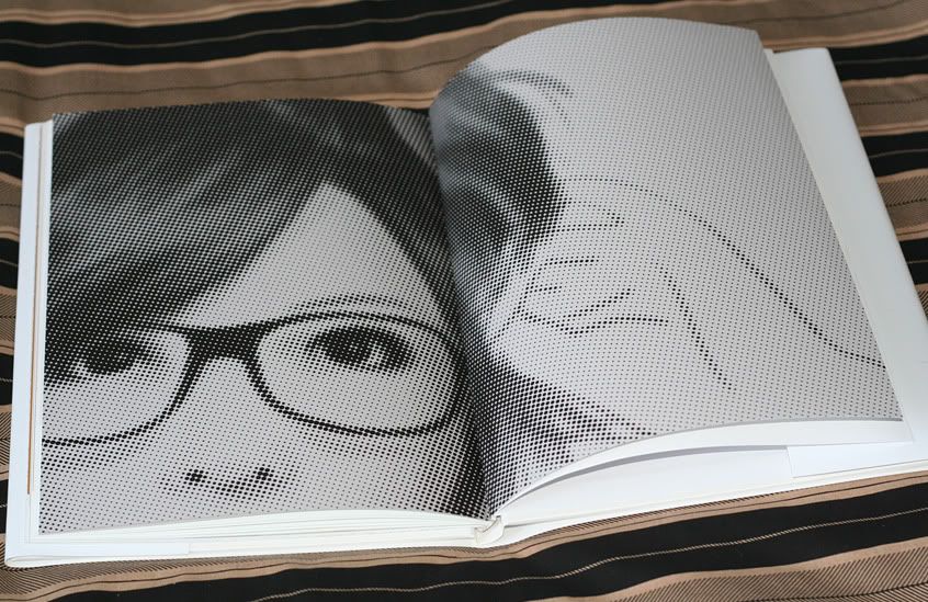
I decided to go with fashion illustrations because I was drawn to the simplicity and elegance. In some sense, it shares similar qualities to my design interests... maybe that's why I liked it. I dunno. Anyways, these artworks are based on real photographs of models. It was done via Sai, because I wanted to employ that slight watercolour effect which isn't so easily harnessed in Photoshop (maybe you can, but I'm a newb at this stuff).
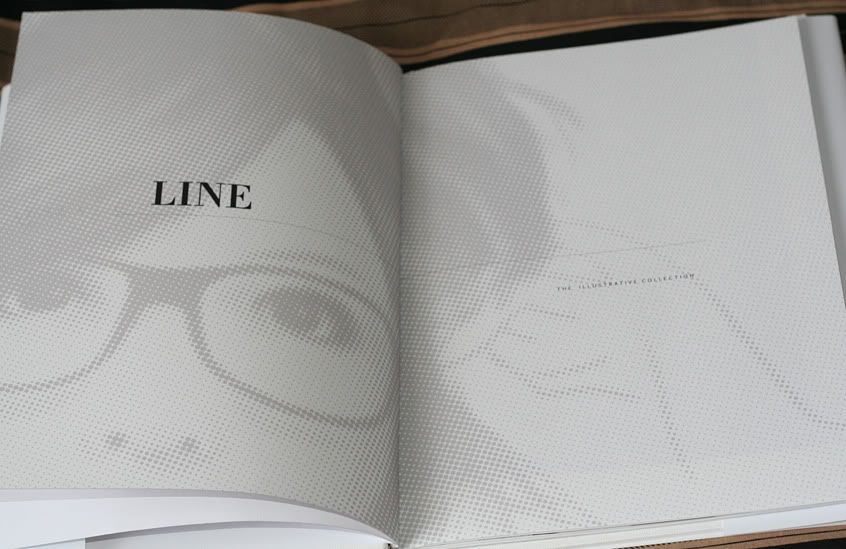
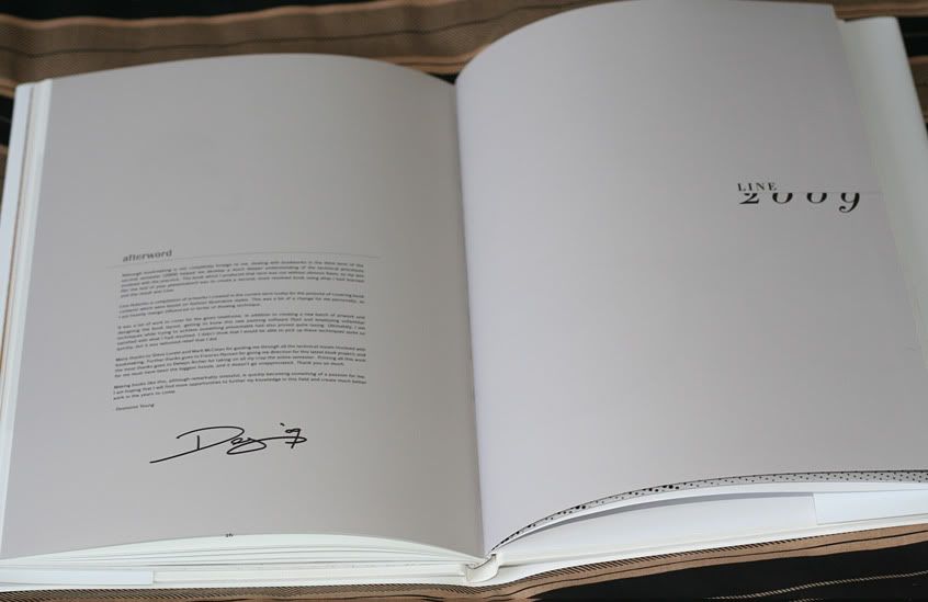
The book itself is called 'Line'. It's a 32 page hardcover, perfect-bound artbook with a dust jacket. The bindery did a great job this time around. I think it's an improvement from my last book, but it's still not what I would call shelf-worthy. If possible I'd like to try out some materials which were made specifically for picture books. This is because the stuff they provide at uni is kind of multi-purpose. It looks pretty decent on the surface, but, if we were to be picky, it could be better. For instance, the dust jacket is too grippy... the semi-matte paper stock obviously wasn't made to be handled this way. Next time around, I'll try out some different printing alternatives who should provide more specific paper stocks. It'll probably do me good to get to know more print places anyway.
One thing that really threw me off was that the background colour in some of the images came out different to the same colour i underlayed it with (so that the picture spreads across two pages). It was strange because I used the paint bucket tool for the background and I didn't think that the eyedropper could pick up variations of that colour... In the end, the technician helped me fix it up much as it would allow, but it's still noticable in some areas.. which is a pain in the ass. Couldn't even detect it on the screen until I went to uni to get it printed, and by that time it was too late to fix completely. Well, shit happens I suppose, and I learn from it.
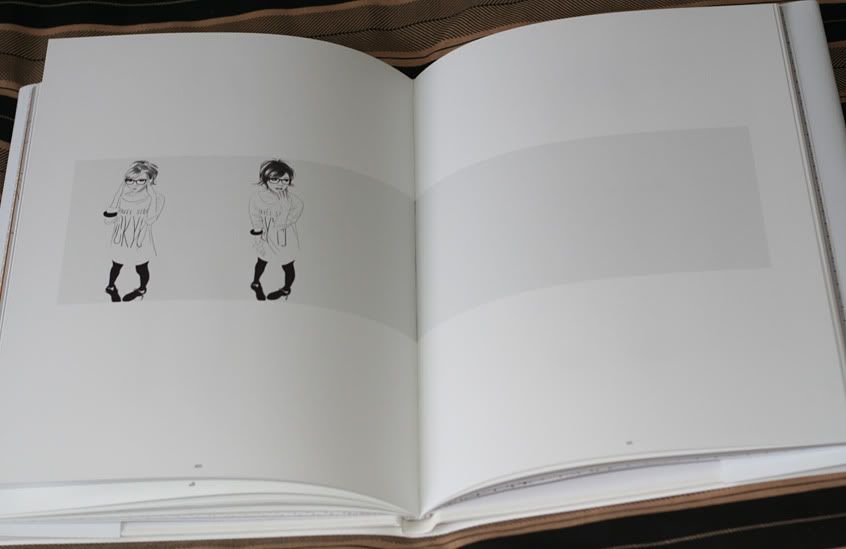
You can see some images of the book below.
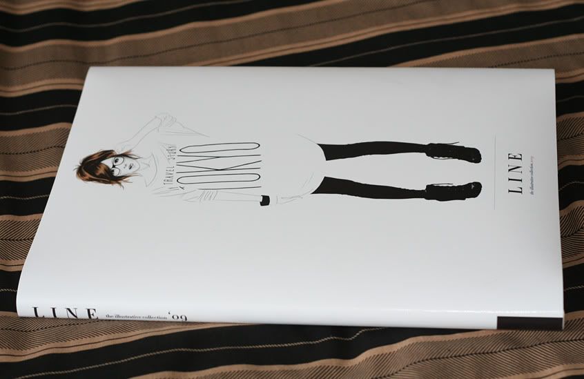 - Cover
- Inside Cover
- Spread 1
- Spread 2
- Spread 3
- Spread 4
- Spread 5
- Spread 6
- Afterword
- Spread 7


2 comments:
I really think you did amazing with this project and I love the images that you decided to show. The style looks very nice and polished as if you have been drawing that way for a while. The fact that you could produce a book in a completely different style than you're used to just speaks a lot about your skill as an artist.
(this is LadyAkuma btw).
Nice work. There are some great images in there and there is a nice, consistent style across the book.
Post a Comment